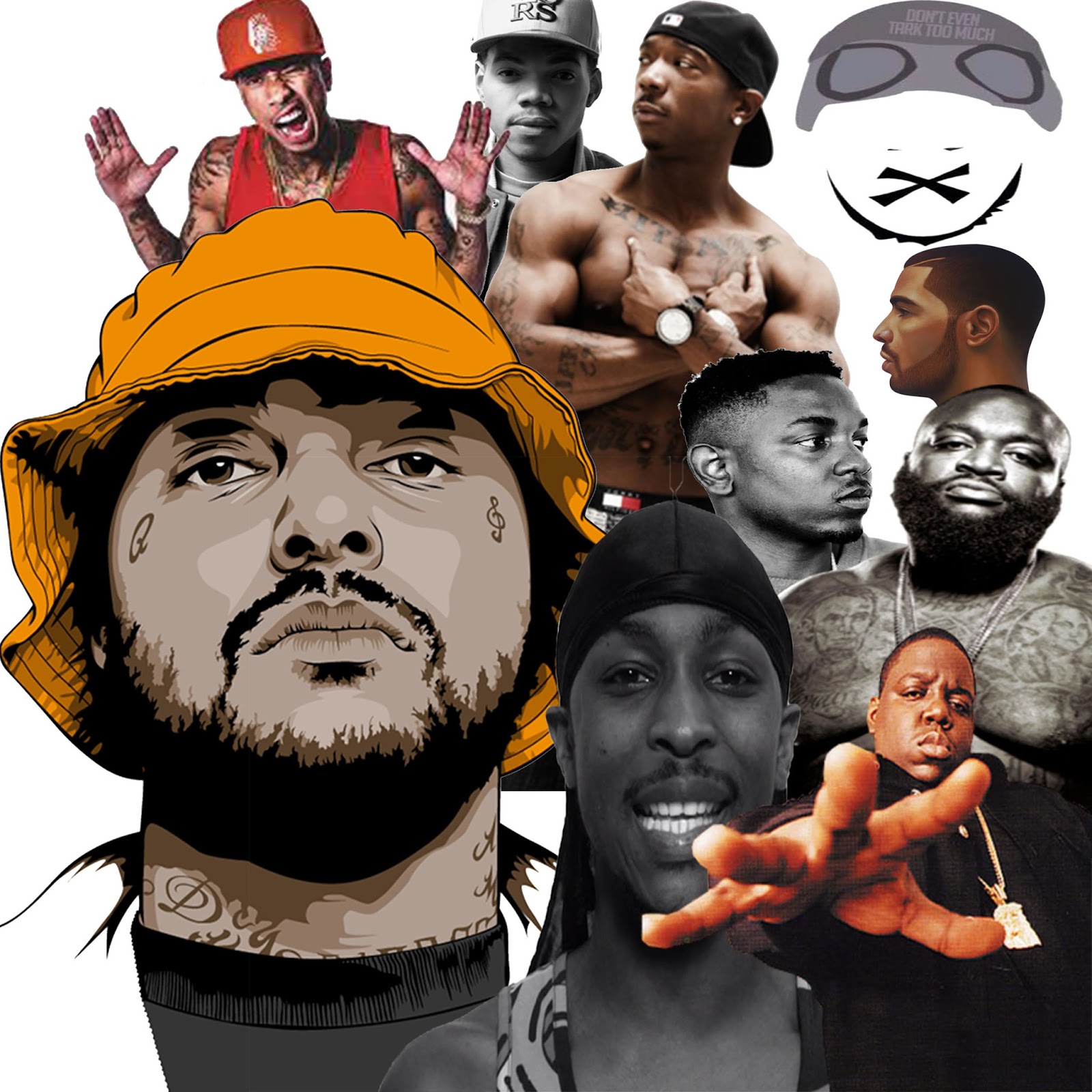
Analysis: Above is the collage that I created as a form of inspiration for my magazine. What i have done is, combined both animations and actual images (photographs) of rap artists who have influenced the rap scene heavily. If you analyse it there are rappers from 1993 to the present, in a way it takes you through a visual journey of rap music. This is what I was aiming for when I decided to combine the past with the present. The rappers are from both UK and USA meaning that there is no biased opinion towards one or the other. This has also deliberately done because, by opening up the variety of rappers in the magazine, it increases the size of the buying market (consumers) due to the fact that there is a higher chance of a favoured rapper of theirs to be in the magazine. By using a combo of photos and animations it also broadens the amount of people interested, this is because some people are more fond of real photos but other people enjoy looking at a cartoon version of their idols or favourite artists. Finally, if I could have improved anything about this piece of work i would include more different objects in the collage. By this I mean things which are also related to the rap artists. An example of this would be a Dr Dre Beats Pill, this is because these are regularly seen in music video's of this genre and would therefore be widely recognised.

Billboard Front Page: This is the front cover of an issue of the 'Billboard magazine' which covers contemporary music of the moment (the charts and new releases). The cover of this particular issue has an image of the famous US rapper Drake on it. This alone is a very good marketing technique due to the fact that they have used an internationally recognised rap artist who is liked by the majority of the general population. He (unlike most other rappers who are photographed) is smiling in this image with a large cheesy grin. This comes as a surprise to those who are looking at this cover because when looking at codes and conventions of rap magazine covers (which have rap artists on them). You will find that the artists are almost always pictured with an intimidating facial expression being worn (to earn status and respect from fans and other rappers). The main font is in white, the masthead, the name of the artist (hot topic) and the story behind the artist. This is because everything in the background is of a dark colour, therefore the white text will contrast this and standout when it is on the shelves in the shops. The smart layout and colour scheme which has been adopted for this cover will appeal to those who are associated with both contemporary music and also those who listen to less recognised rap music and this is because the layout is not biased towards either direction and could be seen as presentable by anyone.

Vibe Front Page: This is a slightly contrasting cover page for 'Vibe Magazine'. The reason for me seeing it as a contrasting cover is the use of extremely bright colours (compared to the monotonous colours used for the Billboard magazine cover). The background of this magazine cover is white, then on top of this (in the foreground) is a vibrantly coloured masthead which is bright yellow, this is the colour which is also used to show the name of the artist in this particular episode. Similar to the 'Billboard magazine' cover, the artist on the cover is in front of the masthead and consequently blocking it out of sight from the front. But back to differences, the layout of the text is very different to that which is used on the front of the 'Billboard magazine'. It's different because firstly, the text is left, right and centre at different levels which looks less appealing than the text layout on the 'Billboard magazine'. This is because, the text is not very well organised and the fonts are different sizes in different areas of the page. Also the fact that the font (for the little snippets of inside information) changes colour regularly just on the front cover suggests that there is no colour scheme being followed by the publishers of this magazine. In contrast to the other magazine (Billboard) the artist on the front of this magazine has the usual facial expression of a rap artist on the front cover of a magazine. His face looks tough and intimidating which makes him seem more powerful and allows him to gain status from fans who look at the magazine. Also the jewelry which is being worn in the photograph on the front page of the magazine sticks to codes and conventions of rap magazines. This is because the chain is large, thick and silver which suggests to the audience that he spent a large quantity of money on it. Which therefore gives off an impression of wealth as well as power and status. Due to the fact that this is what this genre's audience is used to seeing, it means that it will be appealing towards their target audience.

XXL Front Page: This is the most abstract of the three magazines (in comparison between all three). This is due to the high level of text on the front cover, in comparison to the two previous covers, there is a textual overload on this front cover. Similarly to the 'Vibe magazine' the background of this magazine is white which creates good effect. This is because, anything which is layered above this (as long as the white background is still visible) will stand out more than usual because the colour white almost gives you a blank canvas to then layer on top off. Unlike the other two magazines, there are two artists on the front cover of the magazine and neither of these two artists are blocking the readers view of the masthead. In my opinion this is a more sensible layout (artist not blocking the masthead) and this is because it means that there is no chance of a consumer missing it. The colours used for the masthead are also in contrast to one another, the text is white but is placed on a reg backdrop which therefore makes the 'XXL' masthead stand out more. The two artists (who are the main feature in the magazine) have their names displayed on the front cover in large bold text (different colour for each artist). The change in colour between the two artists could suggest to the reader that the style of these two artists is not similar and therefore the colour difference has been used so that they are not mistaken as the same sort of people (they are not associated with one-another musically) but they are related in genuine (because they both produce music of the same genre). This magazine has the bar code in the bottom right and the masthead in the top left which means they're on opposite sides. As a result of this layout they have enough room on their front cover for a photograph of two artists alongside a high level of text which tells the reader what they get inside the magazine.

Billboard Contents Page: This is a contents page from a 'Billboard magazine', in my opinion this is a very well presented contents page. There are several reasons for my perspective, one of them being the layout. The layout makes the page easy to navigate (meaning that readers of the magazine will not waste time looking for what they want to read). There are images with numbers in their corners, these are page numbers. Instead of making all bits on the contents page text, they have decided to put an image of the artist who the article is about with a page number. This is smart because it stands out more than the text would usually. The four articles on the contents page (which have images with them) are most likely to be the most significant articles of those in the magazine. Also, the colour of the background is white, this is another very smart decision by the designer of this contents page. This is because it allows everything in front of it to be accentuated as a result of the plain background (because any colour will stand out from the white back drop). The text on the contents page is mainly black and blue, this is because these colours compliment one another and also they are easily visible on top of the white background. The images on the contents page could also be for audience appeal, this is because they could have selected the chosen artists via using statistics of the most listened to artists. By inserting images of the artists it suggests to the reader that the article is of great importance and therefore the reader is more likely to go to that page and have a read through the article. One of the images of the artists follows all codes and conventions of a rap/hip-hop magazine photo. This is because, the artist is photographed with a straight face which suggests to the reader that they aren't to be messed with which strengthens their status and makes them look as if they are in charge, also the image is not of the artists whole body but instead it is of a mid-shot (from the waist up).

Vibe Contents Page: This is the contents page which was in a copy of 'Vibe magazine'. Compared to the last contents page, this one is rather monotonous, this is made clear because the only aspect of colour on the page is the object in the ladies hand (which is wrapped around Kanye's chest). In the background there is a large V, from my perspective this 'V' is a symbol towards the fact that the contents page is for 'VIBE magazine'. The layout is also in contrast to the last one that I analysed, this is because there is only one large image used for this contents page (in comparison to the four used in the previous one). The conventions of the image itself are highly similar, the artist has been photographed with a facial expression which makes him look intimidating and controlling because this is how they want to be seen by their supporters and fans. The image taken is also a mid-shot which is the type of shot used for almost every single rap artists photo shoots. The colours used (to effect) are black, grey and white. This is quite a sophisticated range of colours to be used to a rap/hip-hop magazine (seeing as the music is usually vibrant in both lyrics and instrumentals). The use of the woman's arm in the photograph of the artists is also very effective, this is because it gives the contents page a sexual appeal. It also increases the sex appeal of the artist himself, due to the fact that it makes it seem as if there are women clinging onto him. The text which is used to show page numbers etc. is not large enough in my opinion, this is because the image is so much larger than it (meaning that the readers attention is first drawn to the artist photographed) which is a positive because its clearly the main article. For those readers who then want to look for a different article, then that is where the texts weakness is. This is because it is small and the font used is quite squiggly which means when in a small font it can be difficult to read.

XXL Contents Page: This is the contents page for 'XXL magazine'. This strongly juxtaposes the other two that I have analysed, this is for several reasons. One of the reasons being that the background for this is colourful (compared to the blank white colour used on the other two). In my opinion this is a very appealing contents page. As a result of the photo having a coloured background (of a dark shade) it means that all of the text can be in the same colour without having to change when the background colour changes. Also, because there is a large level of colour used in the background, it means that the artist featuring in this issue will be able to stand out even when wearing black and white (as he is). The masthead for the magazine is placed in the top right corner of the contents page, this is a good branding technique because people who see someone with the magazine will be able to identify what magazine it is which is being read (without any use of the front cover). All text on this contents page is black or white and this is achieved as a result of the coloured background, darker font is easier to interpret and therefore this is another strength for this contents page. On the other hand, the conventions (not all of them) of the typical rap/hip-hop magazine have been broken in the making of this contents page. This is because, the artist featured on the page is not shown in a mid-shot and instead is shown in a long-shot which shows him from head to toe. This contents page is the reverse/opposite of that we would expect to see (after analysing the previous two) this is because all of the colour in the other two was in the foreground, on the other hand this issue of 'XXL magazine' has all of the colour in the background (leaving the monotonous colours in the foreground for text). In my opinion this is the better way of presenting a contents page and this is because the colourful background makes the whole page colourful and eye catching meaning the reader is more likely to stop on this page and extract some information from it.

Billboard Double Page Spread: This is a double page spread article from the music magazine 'Billboard'. One page from the double page spread is used for an image of the artist (relative towards the article on the other page). This photograph of the rapper has been taken at a mid-shot angle which is a regular convention of rap/hip-hop magazines. Another aspect of the photograph which is also a regular aspect of rap/hip-hop magazines is the facial expression that the rapper has on his face. He is not smiling or scowling but his face looks tough which is exactly what the artist is aiming to achieve, the reasoning behind this is that they want to make the people looking at the image feel as if he is in power and not anyone else. If he was to have an image of him taken where he was smiling, this would be seen (by fans of this genre of music) as soft. The background of the who double page spread is white, this is once again a highly intelligent technique. This is because it makes everything in the foreground stand out that but more (unless it is also white which means it's blend). The main bit of text is in black (which is in contrast to the white backdrop), this is effective because it means that those who read the article and don't just look at the pictures will not have trouble reading the information. In the title for the article they have combined the work time with the rappers name (which is T.I.). This is effective because it could boost audience appeal, a play on words always appeals to anyone. Another way in which the publisher/designer of this article has increased audience appeal is through their use of colour. This is because anything which is of significance is inside a coloured box/circle or if not the text itself is coloured vibrantly.

Vibe Double Page Spread: This is a double page spread which was in the music magazine named 'Vibe'. Similarly to the 'Billboard' double page spread, there is one page which is purely dedicated to an image of the artist who the article is about. The other page has a white background with black and yellow font. You may notice that the artists hat is also black and yellow. This is because the artist who they are writing about is called Wiz Khalifa and his first major hit (on the mainstream system) was a song called black & yellow. In the image of the artist he is made out to look extremely cool. The photo was taken in a close-up shot (which isn't the most common shot but isn't the most foreign in a music magazine either). In the photograph he is smoking (probably marijuana) and once again the artists facial expression tells the reader that he is in control and not playing around. There is a large 'WK' on the right page of the double page spread, this stands for Wiz Khalifa (the artist who the article is based on). Under this the next heading says "how high?". This further suggests to the audience that he is not just smoking tobacco in the action shot of him smoking on the other side of the double page spread. The reasoning behind the white background is that it allows any colour to be visible on top of it. Therefore there is no chance of any textual information being missed or processed in an incorrect fashion. A large number of people who listen to and create rap/hip-hop music smoke marijuana which is another reason for the photograph showing the artist in the spotlight doing what they all do.

XXL Double Page Spread: In comparison to the other two double page spreads I have analysed, this article from 'XXL Magazine' is highly monotonous. The only colours involved in the whole double page spread are black and white. This could be for two reasons, the topic of the article could be of quite a serious nature and therefore the use of colour could create unwanted connotations which were not meant. The other reason would be that all information on the two pages is of equal significance and therefore the use of colour could suggest to the reader that one area of the article is of more importance than another area of the double page spread. Like the other two articles I have analysed, there is one whole A4 page which is dedicated towards a photograph of an artist (the one who is relative to the article on the page opposite). The title of the article is in a pixelated font which suggests another reason for the black and white theme. It could be because the article is about something which happened in the past, before colourful productions. White font has been used on top of the black background of the picture and black font has been used on the white background. This is because they stand out from one another and therefore no information will go unseen. The photograph of the artist is one which follows the codes and conventions of rap/hip-hop, this is because it is a mid-shot of an artist with a facial expression and body language which suggests that they are in power and nothing is worrying them and nothing will worry them.

This is the front cover of the 'XXL Magazine' which I have selected as an inspirational piece. I have strong reasoning behind my selection, from the ranges of colours used to the angles of shots. Firstly, the colours in the background of this front cover are bright and vibrant. This is unusual for the front cover of any magazine, as a result of a bright background it means that anything that is in the foreground will stand out with emphasis. This is because the the bright colours in the background will make the colour in the foreground look darker than it actually is. Although the masthead is also a bright colour, the colour of the background also makes the large white and red masthead stand out from the page. This brings me to my next point, the artist on the front cover has been made to look extremely powerful and high status. This is because, the portrait close-up of his face is placed at the very top (in layering terms) of the page. This means that there is nothing on top of it and therefore it is in front of that masthead which is not what usually happens with magazines as branding is crucial (seeing as the rate of magazine sales is on the downfall). Finally I would like to discuss the text-based information. This is because it has been very well thought out, in terms of placement, colouring and sizing. The placement of the text is faultless, there is no text which overlaps the artists portrait. Also the font (on the right side of the cover page) is nice and clear. This is as a result of suitable colour and size choice, the neutral colours white and yellow stand out on both bright and dark backgrounds. This why these colours have been used for the text, and as a result of this smart selection there is no difficulty when trying to process information.

Here is the contents page for the same 'XXL Magazine' as the one used for the front cover analysis. The same colouring has been used for the background of the contents page and this is also another sensible technique, this is because it begins to show a trend and it also means that colour schemes are stuck to. As a result of this, it means that they can keep the same text colour and size throughout the whole magazine without having to worry about change in tone etc. One other thing this contents page is that the image used is not like the usual one used for a rap artist in a rap magazine. This is because, usually in a rap magazine, the codes and conventions are that the rapper will usually have a mid-shot/close-up of themselves looking as if they are intimidating, wealthy and controlling which is how they require to be seen by the people who follow their music. This contents page on the other hand, shows a photograph of the rappers full body (which is also referred to in media as a long-shot). 'XXL' have done this so that they are not referred to as mainstream or regular, by taking the photo's of the rapper at distances which are not normal it makes them individual. As a result of this their magazine will start to stand out from the others (because they all follow the same codes and conventions). This is a big risk because it could either really promote their audience appeal because they are different to the others, but on the other hand it could also lead to a plummet in audience appeal, due to the fact that the magazine is so different to the normal rap music magazine.

Here is the double-page spread from the same 'XXL Magazine' as the one used for the analysis of the front cover and contents page. This is very similar to every other double page spread in a rap magazine apart from one specific aspect. This aspect which is different is the differentiation between the two sizes of fonts on the page with the text-based information on it. There is a paragraph on the top half of the page which is in a large and bold font, followed by two small paragraphs beside one another which have a font which is not as bold and which is smaller than that used at the top of the page. This suggests to me that the information on the top half of the page is more significant than the information towards the bottom of the page. This in my opinion is a very smart technique for getting more important information across before the less significant information is presented to the reader. The portrait of the artist on the page opposite (which is a long-shot of the artist) is also slightly abstract for a rap magazine. This is because an image of a rapper is usually taken in mid-shot or close-up whereas this one is not and instead shows the rappers whole body. The colour scheme has been strong throughout this issue of the magazine and once again has been used to its full potential for this article in the magazine. This is because, the colour in the background of the image on the right is bright and therefore creates a contrast between the two pages in the double page spread. As a result of this contrast, both the photograph and the article of textual information are emphasised and they stand out more because the two pages look so different from one another.
Timeline of music magazine development:
This is a video I have composed which is a journey through the changes in music magazines from the year 1988 to the year 2014. I chose this time period because the genre of music my magazine will cover is rap music. In 1988 there were two well established rap music magazines in the market, these were 'The Source' and 'XXL'. In the year of 2015 technology (as it always is) has been evolving, therefore the demand for magazines has decreased. As a result of this, there are not many music magazines (which cover rap music) being published in this day and age. This is another reason for me picking rap music as a genre, it will provide something fresh to the world of media. As time has gone on, the quality of photographs used for the front covers of music magazines, this is another result of technology becoming more and more advanced. Another aspect of music magazines which has changed over time is the styling and presentation of the artists. This is made clear because, in the 1988 issue of 'XXL Magazine' there is an image of the rapper Jay-Z on the front cover. He is seen here wearing an odd pair of sunglasses (which were highly fashionable in this time period) and a long leather coat. On the other hand, in the 2014 copy of 'XXL Magazine' there is a photograph of two artists. They contrast the image of Jay-Z highly, this is because they are photographed in a different shot wearing clothing which highly contrast the 1988 issue of this magazine.

Townsquare Media
Formerly known as Regent Communications Inc. (until 2010), Townsquare Media is an American media company which is located in Greenwich, Connecticut. To begin with, the company started in radio. As of the 13th August 2010, after the acquisition of sister companies Gap broadcasting and GapWest Broadcasting, they were in ownership of 171 radio stations in 36 radio markets. As of its IPO date, Townsquare Media is the third largest AM/FM operator in America owning over 310 radio stations in 66 different markets. Later on in it's legacy, Timesquare Media expanded into digital publishing and marketing. Alongside this came the acquisition of the MOG Music Network, a group of former AOL Music blogs. There was also the launch of their mobile app radioPup, which is designed to broadcast their radio stations from your mobile device as well as the digital news content which also features in the application.
Although the 'XXL Magazine' was not created by Townsquare Media, they are the institution in which the brand name lies now. In September 2014, Townsquare Media acquired XXL, King and Antenna from Harris Publications. After this Townsquare Media also ceased print publication of 'XXL Magazine' as a result of the magazine sheer success.
Key conventions which must feature in my final magazine:
Front Cover Features:
For the front cover of my magazine there is one certain convention which is almost a golden rule. This is the golden rule for rap magazines which is to have a close-up/mid-shot of the main artist on the front cover of the magazine. In this photograph of the artist they must be posing with a facial expression which suggests to the reader that the artist is of a high status and has a large amount of money, respect and girls. This is regularly shown on the front of magazines (such as Vibe, XXL and The Source) and this reinforces the idea that this is a regularly used technique in the publication of these types of magazines. This is because there is never a magazine purely about one artist, but on the other hand there are magazines which are heavily related to a singular artist and this artist is always the one on the front cover. Therefore the artist on the front is the most important and relevant and that is why they earn their place on the front page. This will appeal to the needs of both the audience that I have selected and also the policies which are also followed by the other rap magazines. As a result of this being the normal in the genre of magazine, I will follow the codes and conventions so that I can maximize the potential of my magazine and its sales figures.
By looking at the rap magazines of the present you can develop a clear understanding for what is required for a successful. This is because all of the magazines are so ridiculously similar in several different ways. One of these being that the masthead/title of the magazine on the front page is always the largest item of text on the page. In my opinion this is a good aspect of these magazines, this is because there are a small minority of these magazines. Therefore when someone see's the logo for the rap magazines they will identify them at ease. This is for two reasons, one of the reasons is that the magazines masthead will be more eye catching than a normal music magazine and therefore the customer is more likely to pick up the magazine and have a look at it. The other reason for this is that rap magazines are rare, therefore when the masthead of one of these rap magazines will come as a rarity. As a result of this, when seen the masthead will seem unfamiliar/rare and will therefore entice a customer into picking this magazine up to see more about this magazine.
Contents Page Features:
For the contents page of my rap magazine I will follow one or two of the codes and conventions of the other rap magazine contents pages which I have looked at. One of the regular features of these contents pages are things such as images placed in specific places (usually the same place) on the contents page. Another one is the main bulk of text's positioning which is also highly repetitive as it appears in the same area of each magazine (even if it has been published by several different magazines). These do not only appear in the magazines of the same brand but there could be 3 different rap magazines which are not made by the same company (XXL, The Source & VIBE). The first code/convention I have intentions of following is the placement of the image on the contents page. This is not only because it is what is seen as the usual in rap magazines but it is also the most suitable area for an image. The location of the image is the top left of the page, the reason for me feeling that this is the most suitable image location is that it is the first place your eyes fall as you come onto a new page (as its where the beginning of the text would be).
The other code/convention where I would also like to follow in the footsteps of the already well-established rap magazines is another aspect of layout. This time its the location of the text (the main bulk anyways). This is symmetrically located to the image of the rapper. This is another sensible decision, this is because they catch the readers eye with the image (which is the most interesting aspect of the page). Therefore the once the reader has finished looking at the image on the contents page they will surely just move onto the next area of the magazine which is interesting. If there is a large bulk of text which looks as if there is nothing to it then there isn't going to a lot of readers who will want to read it. On the other hand, if the text is spaced out sensibly then it doesn't look like there is anywhere near as much. As a result of this there will be a larger population of the magazines readers processing all information. By identifying that the tribe my magazine is aimed at is the 'Urban' category, I think that the more minimal the amount of text then the more likely the reader is to be interested in the text because it doesn't look as if it'll take as long process the information.
Double Page Spread Features:
There is only one code/convention which regularly appears in rap magazines which I would like to adopt and use in my magazine. This is because the double page spreads are all highly contrasting and therefore it is extremely difficult to identify an aspect which you see in a positive fashion. The aspect of rap magazines which I find is the most sensible is the use of large images and small text based information on top of this image. This is because there is an extremely large image in the background, therefore if text is placed on top of the image it will still struggle to obstruct the image. This is because (unless the font is extremely large and bold) the font will be of a suitable size and therefore it can be sensibly placed so that there is nothing important in the image which is obstructed by text. Also the use of the large image in the background for the D.P.S is extremely sensible for another reason as well. This is because it is the aspect of the page which would be classed as most enticing and eye catching. Therefore by making it cover the whole two page spread (or at least one whole A4 side) it means that the most colourful area of the two pages is the largest aspect and therefore it will catch people's eyes at ease.
Audience Categorisation:

Here is a table which shows you the 6 different social grading classes from grade A to grade E. By looking at the usual audience of my music genre, I predict that my audience is going to be in social grade E. This is because the majority of the population fond of rap music are those who are still in school. This is because rap/grime started on the streets and that's where it plans to stay, also with such a wide social media network they are the perfect target. This is because they are the generation that will have the highest level of capability on social media and using technology as it evolves. Also the use of the share feature (frequently used) gives artist the chance to promote songs, EP's and mix tapes. It's nothing to do with employment but the students are what makes my audience in social grade E. They wouldn't all be grade E social class people. This is because there will be some working class people who are old enough to have jobs that also listen to this genre of music. This means that the money for the magazine (no more than £3) will be affordable for all ages who are interested. Social grade E will receive funds for the magazine from their parents or guardians and those from social grade D interested in the magazine will buy it out of their hard earned wages. I'm not narrowing it down to just social grade's D and E, instead I am discussing with you those who are most likely to be interested in the magazine but the interest could come from all categories just at different rates.
Front Page Flat Plan:


 There are several different forms of technology which I have learnt about and how to use when producing my media product, one of these being Blogger. This is the website which all of the students in my class used to present their work to our teacher and also to the people who will be assessing this work for an official grading. It is a very easy and adjustable blogging website which almost makes the blog seem as if it is your own design. As a result of this, you can really express what you wish to include in your piece of media by using this website to produce your blog. When I first went onto the website and created and designed the blog page itself, I found it ridiculously easy to achieve what I wanted to in the design aspect of the page. There were several preset options to choose from which were actually relevant to what people would make a blog about and not just random images. I didn't even know that creating something which looked so complex was so easy and this made me feel more confident in exploring the websites features some more. Eventually I managed to insert my custom designed masthead to the blog page and this meant that the blog really began to look as if it were an official website. I also managed to work out how to insert games and logos onto my blogs page to give it an even more realistic feel and therefore increase the chances of achieving the highest marks possible.
  Another form of technology I used and learnt about was Survey Monkey. This website was what I used when producing my audience research statistics and it was an easy to use website which was laid out very well and easy to use. It took me roughly 15 minutes to design my 10 question survey and produce a URL which I then sent out to my media class and friends who also attend my school of different ages so that the results I got were not biased to a singular age group. Once I had received some responses to the survey and people were beginning to complete the survey, I was notified by the website vie notifications on my smart phone and also emails and text messages. This was useful because it meant that regardless of what form of technology/media I was using I would know that people were responding to my survey. Once the notifications died down and they were coming through less regularly I decided that it was time to analyse my results and this was a lot easier than I thought it would be. This is due to the fact that the Survey Monkey website put the results from the survey into percentages between the different categories and also put them into bar graphs meaning that there several different ways of analysing the results and minimizing the likelihood of confusion and incapability to read the data.
  I also used Outlook during the process of creating my media product. This was to contact the people who I wanted to take part in my survey. As a result of this I discovered how to compose a formal email which can be used in future and is therefore a useful skill which I have acquired from this course. I also used Outlook to contact my model and my teachers. I made enquiries about my work to my teachers and told my model where and when the photo shoot was taking place in order to ensure they were aware how things would take place. In order to get equipment out like cameras and green screens, I had to fill out a form for hire and send it off to them so that they knew what it was that I required, when I would require it and how long I would require it for. This meant that I had to regularly check my emails and compose emails which were suitable in a formal situation so that I could get the photos taken in time and return the equipment undamaged and in the same condition that I received them in.
  Another form of technology I used was the equipment which I used for my photo shoot. These forms of technology consisted of a green screen, lighting, foldable reflector and the camera I used which was a Canon DSLR camera. The green screen was a very easy to use piece of equipment, this is because it unfolded itself and all you had to do was get two people to hold it behind your model whilst you are taking the photos of them. The other convenient thing about the use of a green screen is that they made the editing aspect of producing a large amount easier. This will be discussed in more depth when I get to the Photoshop analysis.The next item I am going to look at is the lighting used, these were LED lights which gave the model and their clothing a smoother finish in the cameras lens and as a result of this I placed three different ones down. One of the lights was used as a key light, the next one was a fill light which I learnt about in the research process of my media production. The final light was a back light which meant that there was artificial lighting coming from three angles which is what most photos taken use. The three lights were placed on tripods so that they didn't move once set in a certain position meaning my model could stay in the same position and wouldn't be required to move in aid of the lights. I also used a foldable reflector which meant that the light was directed onto the subject of the photo and wasn't straying off in a different direction. The final piece of equipment which I used on the photo shoot was the camera itself. I used a Canon DSLR which is a camera the DSLR stands for Digital Single-Lens Reflex camera and it has this name due to the fact that it combines the optics and mechanisms or a dingle-lens reflex camera with a digital imaging sensor (as opposed to the used of photographic film). This camera was extremely easy to use due to the fact that it almost focused on the subject automatically and the zoom was a manual operation. This is because you had to twist the lense in order to zoom in or out meaning that there was no possibility of technical malfunction with this process. Overall the equipment I used for the photo shoot was very easy and effective to use which meant I could could get the shoot done fast and efficiently without having to go into overtime with my model who had a football match soon after the shoot.
  The final thing I learnt about technology during the process of producing my media product was how to use the software Photoshop for editing images. This process was made a lot easier through the use of a green screen in my photo shoot and I knew this because for my preliminary I didn't use one and I still had to edit the images which was not possible with the magic wand tool and instead I had to use the eraser tool and hold a very steady hand (which I found very difficult). When I used the green screen, I was able to use a tool on the software called the magic wand tool, this was a tool which selected all the areas which were green surrounding the model (subject) and therefore all I needed to do was press the backspace button to clear the green screen from the image leaving the subject there with nothing surrounding him. After this I needed to insert the text and boxes which would contain the text. This was also made very simple due to the fact that the Photoshop software held a plethora of fonts which respectively matched different genres and after searching for just a few minutes I managed to find a font suitable for the genre of my music magazine. The software also contained a shape creating tool which allowed you to create shapes from circles to rectangles to squares to stars etc. This also became very useful because it meant I could insert the text at the size which I wanted it to be and then make the shape around it. There was a function which was 'CTRL + T' which allowed you to edit the shape and size of any object on your work with ease and then press the 'ENTER' button once you had made it into the shape which you required it to be. The software on a whole was very easy to use and this is because it was set out in a basic layout meaning all functions had icons which represented what they were and there were tutorial and walk-through videos on YouTube and Adobe websites which made all things I didn't know how to do very easy.

 The other well-known magazine which covers news on rap music and hip-hop music is called ‘VIBE’ magazine. This magazine was founded in 1993 by producer Quincy Jones. This particular music magazine was heavily focused upon R&B and Hip-Hop music artists, actors and other entertainers of sorts. Production of ‘VIBE’ magazine was bought to an end in the summer of 2009 but was then purchased by new owners and the magazine is now issued semi-monthly and features double covers and a large online presence. The main target audience for the magazine is predominantly urban, youthful followers of the hip-hop/rap culture. In the year of 2014, the magazine announced that they would only publish their magazine on the internet so they became ‘online-only’. The inside of the magazine consisted of question columns, celebrity gossip, fashion updates and many more features which is just one of the many reasons for the extreme popularity of this magazine.
 -A bold title containing vibrant and contrasting colours to catch eyes. Covers a large amount of the top half of of the page.


 High angle-

 This is the front cover of XXL magazine, this is a magazine which mainly covers rap and hip-hop music. On the front cover of this copy, there is an image of Jay-Z. In this image. Jay-Z looks like he is an intimidating character who is high in status. This is suggested via the colours used, the layout of the cover page and also the fact that his portrait is in front of the masthead of the magazine he is featuring in. There is a low level of text-based information, this is because the image is enough to drag the audience in to take a further look inside at the magazine. This is because, due to a lack of information on the front, it leaves it to the readers imagination meaning they will be intrigued to see the other contents of the magazine. Also the artist on the front is looking highly presentable in this image, this is because a rappers image is very important for their success. This is due to the fact that they base their success on how much they have and have earned.