This is a video I have composed which is a journey through the changes in music magazines from the year 1988 to the year 2014. I chose this time period because the genre of music my magazine will cover is rap music. In 1988 there were two well established rap music magazines in the market, these were 'The Source' and 'XXL'. In the year of 2015 technology (as it always is) has been evolving, therefore the demand for magazines has decreased. As a result of this, there are not many music magazines (which cover rap music) being published in this day and age. This is another reason for me picking rap music as a genre, it will provide something fresh to the world of media. As time has gone on, the quality of photographs used for the front covers of music magazines, this is another result of technology becoming more and more advanced. Another aspect of music magazines which has changed over time is the styling and presentation of the artists. This is made clear because, in the 1988 issue of 'XXL Magazine' there is an image of the rapper Jay-Z on the front cover. He is seen here wearing an odd pair of sunglasses (which were highly fashionable in this time period) and a long leather coat. On the other hand, in the 2014 copy of 'XXL Magazine' there is a photograph of two artists. They contrast the image of Jay-Z highly, this is because they are photographed in a different shot wearing clothing which highly contrast the 1988 issue of this magazine.

Monday, 30 November 2015
Front cover, contents page & double page spread inspiration.

This is the front cover of the 'XXL Magazine' which I have selected as an inspirational piece. I have strong reasoning behind my selection, from the ranges of colours used to the angles of shots. Firstly, the colours in the background of this front cover are bright and vibrant. This is unusual for the front cover of any magazine, as a result of a bright background it means that anything that is in the foreground will stand out with emphasis. This is because the the bright colours in the background will make the colour in the foreground look darker than it actually is. Although the masthead is also a bright colour, the colour of the background also makes the large white and red masthead stand out from the page. This brings me to my next point, the artist on the front cover has been made to look extremely powerful and high status. This is because, the portrait close-up of his face is placed at the very top (in layering terms) of the page. This means that there is nothing on top of it and therefore it is in front of that masthead which is not what usually happens with magazines as branding is crucial (seeing as the rate of magazine sales is on the downfall). Finally I would like to discuss the text-based information. This is because it has been very well thought out, in terms of placement, colouring and sizing. The placement of the text is faultless, there is no text which overlaps the artists portrait. Also the font (on the right side of the cover page) is nice and clear. This is as a result of suitable colour and size choice, the neutral colours white and yellow stand out on both bright and dark backgrounds. This why these colours have been used for the text, and as a result of this smart selection there is no difficulty when trying to process information.

Here is the contents page for the same 'XXL Magazine' as the one used for the front cover analysis. The same colouring has been used for the background of the contents page and this is also another sensible technique, this is because it begins to show a trend and it also means that colour schemes are stuck to. As a result of this, it means that they can keep the same text colour and size throughout the whole magazine without having to worry about change in tone etc. One other thing this contents page is that the image used is not like the usual one used for a rap artist in a rap magazine. This is because, usually in a rap magazine, the codes and conventions are that the rapper will usually have a mid-shot/close-up of themselves looking as if they are intimidating, wealthy and controlling which is how they require to be seen by the people who follow their music. This contents page on the other hand, shows a photograph of the rappers full body (which is also referred to in media as a long-shot). 'XXL' have done this so that they are not referred to as mainstream or regular, by taking the photo's of the rapper at distances which are not normal it makes them individual. As a result of this their magazine will start to stand out from the others (because they all follow the same codes and conventions). This is a big risk because it could either really promote their audience appeal because they are different to the others, but on the other hand it could also lead to a plummet in audience appeal, due to the fact that the magazine is so different to the normal rap music magazine.

Here is the double-page spread from the same 'XXL Magazine' as the one used for the analysis of the front cover and contents page. This is very similar to every other double page spread in a rap magazine apart from one specific aspect. This aspect which is different is the differentiation between the two sizes of fonts on the page with the text-based information on it. There is a paragraph on the top half of the page which is in a large and bold font, followed by two small paragraphs beside one another which have a font which is not as bold and which is smaller than that used at the top of the page. This suggests to me that the information on the top half of the page is more significant than the information towards the bottom of the page. This in my opinion is a very smart technique for getting more important information across before the less significant information is presented to the reader. The portrait of the artist on the page opposite (which is a long-shot of the artist) is also slightly abstract for a rap magazine. This is because an image of a rapper is usually taken in mid-shot or close-up whereas this one is not and instead shows the rappers whole body. The colour scheme has been strong throughout this issue of the magazine and once again has been used to its full potential for this article in the magazine. This is because, the colour in the background of the image on the right is bright and therefore creates a contrast between the two pages in the double page spread. As a result of this contrast, both the photograph and the article of textual information are emphasised and they stand out more because the two pages look so different from one another.
Friday, 27 November 2015
Wednesday, 25 November 2015
Analysis of 3 Magazine Covers, Contents Pages and Double Page Spreads

Billboard Front Page: This is the front cover of an issue of the 'Billboard magazine' which covers contemporary music of the moment (the charts and new releases). The cover of this particular issue has an image of the famous US rapper Drake on it. This alone is a very good marketing technique due to the fact that they have used an internationally recognised rap artist who is liked by the majority of the general population. He (unlike most other rappers who are photographed) is smiling in this image with a large cheesy grin. This comes as a surprise to those who are looking at this cover because when looking at codes and conventions of rap magazine covers (which have rap artists on them). You will find that the artists are almost always pictured with an intimidating facial expression being worn (to earn status and respect from fans and other rappers). The main font is in white, the masthead, the name of the artist (hot topic) and the story behind the artist. This is because everything in the background is of a dark colour, therefore the white text will contrast this and standout when it is on the shelves in the shops. The smart layout and colour scheme which has been adopted for this cover will appeal to those who are associated with both contemporary music and also those who listen to less recognised rap music and this is because the layout is not biased towards either direction and could be seen as presentable by anyone.

Vibe Front Page: This is a slightly contrasting cover page for 'Vibe Magazine'. The reason for me seeing it as a contrasting cover is the use of extremely bright colours (compared to the monotonous colours used for the Billboard magazine cover). The background of this magazine cover is white, then on top of this (in the foreground) is a vibrantly coloured masthead which is bright yellow, this is the colour which is also used to show the name of the artist in this particular episode. Similar to the 'Billboard magazine' cover, the artist on the cover is in front of the masthead and consequently blocking it out of sight from the front. But back to differences, the layout of the text is very different to that which is used on the front of the 'Billboard magazine'. It's different because firstly, the text is left, right and centre at different levels which looks less appealing than the text layout on the 'Billboard magazine'. This is because, the text is not very well organised and the fonts are different sizes in different areas of the page. Also the fact that the font (for the little snippets of inside information) changes colour regularly just on the front cover suggests that there is no colour scheme being followed by the publishers of this magazine. In contrast to the other magazine (Billboard) the artist on the front of this magazine has the usual facial expression of a rap artist on the front cover of a magazine. His face looks tough and intimidating which makes him seem more powerful and allows him to gain status from fans who look at the magazine. Also the jewelry which is being worn in the photograph on the front page of the magazine sticks to codes and conventions of rap magazines. This is because the chain is large, thick and silver which suggests to the audience that he spent a large quantity of money on it. Which therefore gives off an impression of wealth as well as power and status. Due to the fact that this is what this genre's audience is used to seeing, it means that it will be appealing towards their target audience.

XXL Front Page: This is the most abstract of the three magazines (in comparison between all three). This is due to the high level of text on the front cover, in comparison to the two previous covers, there is a textual overload on this front cover. Similarly to the 'Vibe magazine' the background of this magazine is white which creates good effect. This is because, anything which is layered above this (as long as the white background is still visible) will stand out more than usual because the colour white almost gives you a blank canvas to then layer on top off. Unlike the other two magazines, there are two artists on the front cover of the magazine and neither of these two artists are blocking the readers view of the masthead. In my opinion this is a more sensible layout (artist not blocking the masthead) and this is because it means that there is no chance of a consumer missing it. The colours used for the masthead are also in contrast to one another, the text is white but is placed on a reg backdrop which therefore makes the 'XXL' masthead stand out more. The two artists (who are the main feature in the magazine) have their names displayed on the front cover in large bold text (different colour for each artist). The change in colour between the two artists could suggest to the reader that the style of these two artists is not similar and therefore the colour difference has been used so that they are not mistaken as the same sort of people (they are not associated with one-another musically) but they are related in genuine (because they both produce music of the same genre). This magazine has the bar code in the bottom right and the masthead in the top left which means they're on opposite sides. As a result of this layout they have enough room on their front cover for a photograph of two artists alongside a high level of text which tells the reader what they get inside the magazine.

Billboard Contents Page: This is a contents page from a 'Billboard magazine', in my opinion this is a very well presented contents page. There are several reasons for my perspective, one of them being the layout. The layout makes the page easy to navigate (meaning that readers of the magazine will not waste time looking for what they want to read). There are images with numbers in their corners, these are page numbers. Instead of making all bits on the contents page text, they have decided to put an image of the artist who the article is about with a page number. This is smart because it stands out more than the text would usually. The four articles on the contents page (which have images with them) are most likely to be the most significant articles of those in the magazine. Also, the colour of the background is white, this is another very smart decision by the designer of this contents page. This is because it allows everything in front of it to be accentuated as a result of the plain background (because any colour will stand out from the white back drop). The text on the contents page is mainly black and blue, this is because these colours compliment one another and also they are easily visible on top of the white background. The images on the contents page could also be for audience appeal, this is because they could have selected the chosen artists via using statistics of the most listened to artists. By inserting images of the artists it suggests to the reader that the article is of great importance and therefore the reader is more likely to go to that page and have a read through the article. One of the images of the artists follows all codes and conventions of a rap/hip-hop magazine photo. This is because, the artist is photographed with a straight face which suggests to the reader that they aren't to be messed with which strengthens their status and makes them look as if they are in charge, also the image is not of the artists whole body but instead it is of a mid-shot (from the waist up).

Vibe Contents Page: This is the contents page which was in a copy of 'Vibe magazine'. Compared to the last contents page, this one is rather monotonous, this is made clear because the only aspect of colour on the page is the object in the ladies hand (which is wrapped around Kanye's chest). In the background there is a large V, from my perspective this 'V' is a symbol towards the fact that the contents page is for 'VIBE magazine'. The layout is also in contrast to the last one that I analysed, this is because there is only one large image used for this contents page (in comparison to the four used in the previous one). The conventions of the image itself are highly similar, the artist has been photographed with a facial expression which makes him look intimidating and controlling because this is how they want to be seen by their supporters and fans. The image taken is also a mid-shot which is the type of shot used for almost every single rap artists photo shoots. The colours used (to effect) are black, grey and white. This is quite a sophisticated range of colours to be used to a rap/hip-hop magazine (seeing as the music is usually vibrant in both lyrics and instrumentals). The use of the woman's arm in the photograph of the artists is also very effective, this is because it gives the contents page a sexual appeal. It also increases the sex appeal of the artist himself, due to the fact that it makes it seem as if there are women clinging onto him. The text which is used to show page numbers etc. is not large enough in my opinion, this is because the image is so much larger than it (meaning that the readers attention is first drawn to the artist photographed) which is a positive because its clearly the main article. For those readers who then want to look for a different article, then that is where the texts weakness is. This is because it is small and the font used is quite squiggly which means when in a small font it can be difficult to read.

XXL Contents Page: This is the contents page for 'XXL magazine'. This strongly juxtaposes the other two that I have analysed, this is for several reasons. One of the reasons being that the background for this is colourful (compared to the blank white colour used on the other two). In my opinion this is a very appealing contents page. As a result of the photo having a coloured background (of a dark shade) it means that all of the text can be in the same colour without having to change when the background colour changes. Also, because there is a large level of colour used in the background, it means that the artist featuring in this issue will be able to stand out even when wearing black and white (as he is). The masthead for the magazine is placed in the top right corner of the contents page, this is a good branding technique because people who see someone with the magazine will be able to identify what magazine it is which is being read (without any use of the front cover). All text on this contents page is black or white and this is achieved as a result of the coloured background, darker font is easier to interpret and therefore this is another strength for this contents page. On the other hand, the conventions (not all of them) of the typical rap/hip-hop magazine have been broken in the making of this contents page. This is because, the artist featured on the page is not shown in a mid-shot and instead is shown in a long-shot which shows him from head to toe. This contents page is the reverse/opposite of that we would expect to see (after analysing the previous two) this is because all of the colour in the other two was in the foreground, on the other hand this issue of 'XXL magazine' has all of the colour in the background (leaving the monotonous colours in the foreground for text). In my opinion this is the better way of presenting a contents page and this is because the colourful background makes the whole page colourful and eye catching meaning the reader is more likely to stop on this page and extract some information from it.

Billboard Double Page Spread: This is a double page spread article from the music magazine 'Billboard'. One page from the double page spread is used for an image of the artist (relative towards the article on the other page). This photograph of the rapper has been taken at a mid-shot angle which is a regular convention of rap/hip-hop magazines. Another aspect of the photograph which is also a regular aspect of rap/hip-hop magazines is the facial expression that the rapper has on his face. He is not smiling or scowling but his face looks tough which is exactly what the artist is aiming to achieve, the reasoning behind this is that they want to make the people looking at the image feel as if he is in power and not anyone else. If he was to have an image of him taken where he was smiling, this would be seen (by fans of this genre of music) as soft. The background of the who double page spread is white, this is once again a highly intelligent technique. This is because it makes everything in the foreground stand out that but more (unless it is also white which means it's blend). The main bit of text is in black (which is in contrast to the white backdrop), this is effective because it means that those who read the article and don't just look at the pictures will not have trouble reading the information. In the title for the article they have combined the work time with the rappers name (which is T.I.). This is effective because it could boost audience appeal, a play on words always appeals to anyone. Another way in which the publisher/designer of this article has increased audience appeal is through their use of colour. This is because anything which is of significance is inside a coloured box/circle or if not the text itself is coloured vibrantly.

Vibe Double Page Spread: This is a double page spread which was in the music magazine named 'Vibe'. Similarly to the 'Billboard' double page spread, there is one page which is purely dedicated to an image of the artist who the article is about. The other page has a white background with black and yellow font. You may notice that the artists hat is also black and yellow. This is because the artist who they are writing about is called Wiz Khalifa and his first major hit (on the mainstream system) was a song called black & yellow. In the image of the artist he is made out to look extremely cool. The photo was taken in a close-up shot (which isn't the most common shot but isn't the most foreign in a music magazine either). In the photograph he is smoking (probably marijuana) and once again the artists facial expression tells the reader that he is in control and not playing around. There is a large 'WK' on the right page of the double page spread, this stands for Wiz Khalifa (the artist who the article is based on). Under this the next heading says "how high?". This further suggests to the audience that he is not just smoking tobacco in the action shot of him smoking on the other side of the double page spread. The reasoning behind the white background is that it allows any colour to be visible on top of it. Therefore there is no chance of any textual information being missed or processed in an incorrect fashion. A large number of people who listen to and create rap/hip-hop music smoke marijuana which is another reason for the photograph showing the artist in the spotlight doing what they all do.

XXL Double Page Spread: In comparison to the other two double page spreads I have analysed, this article from 'XXL Magazine' is highly monotonous. The only colours involved in the whole double page spread are black and white. This could be for two reasons, the topic of the article could be of quite a serious nature and therefore the use of colour could create unwanted connotations which were not meant. The other reason would be that all information on the two pages is of equal significance and therefore the use of colour could suggest to the reader that one area of the article is of more importance than another area of the double page spread. Like the other two articles I have analysed, there is one whole A4 page which is dedicated towards a photograph of an artist (the one who is relative to the article on the page opposite). The title of the article is in a pixelated font which suggests another reason for the black and white theme. It could be because the article is about something which happened in the past, before colourful productions. White font has been used on top of the black background of the picture and black font has been used on the white background. This is because they stand out from one another and therefore no information will go unseen. The photograph of the artist is one which follows the codes and conventions of rap/hip-hop, this is because it is a mid-shot of an artist with a facial expression and body language which suggests that they are in power and nothing is worrying them and nothing will worry them.
Tuesday, 24 November 2015
Music Collage
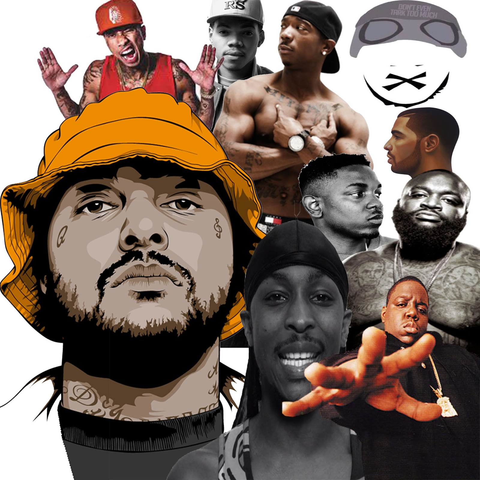
Analysis: Above is the collage that I created as a form of inspiration for my magazine. What i have done is, combined both animations and actual images (photographs) of rap artists who have influenced the rap scene heavily. If you analyse it there are rappers from 1993 to the present, in a way it takes you through a visual journey of rap music. This is what I was aiming for when I decided to combine the past with the present. The rappers are from both UK and USA meaning that there is no biased opinion towards one or the other. This has also deliberately done because, by opening up the variety of rappers in the magazine, it increases the size of the buying market (consumers) due to the fact that there is a higher chance of a favoured rapper of theirs to be in the magazine. By using a combo of photos and animations it also broadens the amount of people interested, this is because some people are more fond of real photos but other people enjoy looking at a cartoon version of their idols or favourite artists. Finally, if I could have improved anything about this piece of work i would include more different objects in the collage. By this I mean things which are also related to the rap artists. An example of this would be a Dr Dre Beats Pill, this is because these are regularly seen in music video's of this genre and would therefore be widely recognised.
Friday, 20 November 2015
Masthead analysis
Billboard Magazine: The 'Billboard magazine' masthead contains quite a high level colour. I think that their reasoning behind this is to make it eye catching towards their audience. The colours used for this masthead are, white, black, yellow, red and blue. The colours white and black are used to make the masthead because they contrast one another. This is what they editor was clearly looking for when in the creation process of this masthead because it makes the masthead stand out more. The colours red, yellow and blue are only used to fill white gaps inside letters (which further emphasises the masthead). The font used for this masthead would be seen as presentable to the public eye as it is all in line and in proportion which is normal. Also due to the fact that a simplistic, block, bold font has been used, it is another suggestion that this magazine wants to be seen as presentable and doesn't want to be original.

Q Magazine: The 'Q magazine' masthead is one which contains two colours and one letter. When something has barely any features it is refers to as minimalist or simplistic because it has been created with minimum levels of layering and also minimal use of font and colour. By just using a singular letter with two colours, it allows the audience (who have an interest in this magazine) to identify this easily and also remember it due to the fact there is nothing similar to it. Also, the colours red and white heavily contrast each other, this is because red is a bright and vibrant colour, whereas white is a bright and plain colour. One strange thing about these two colours being used together are that their colour connotations juxtapose one another. This is because red connotes anger and danger etc. On the other hand the colour white is used to connote peace and cleanliness which are completely in contrast to one another. But my final point about this masthead is that it is very unique and eye catching which is what you look for in a masthead.

Kerrang Magazine:The 'Kerrang magazine' masthead is very different to the other ones which have been analysed in this masthead analysis. This is because, unlike the other ones, this masthead has more just text. This masthead contains other graphics which make it look like there is a layer of broken glass above the text which is relevant towards their audience. This is because rock music is well known for promoting violent thought and action. The only colours used for the masthead are black and white, this could be because these two colours contrast which means that the text is outstanding from the background. The use of the exclamation mark also puts emphasis on the fact that the people who read this magazine see that as normal (over exaggeration and over excitement). The font itself looks as if it is beginning to fall apart and deteriorate and the reason for this is that the
people who listen to this type of musical genre do not take care for appearance into consideration.

Monday, 16 November 2015
Contrasting magazine comparison

This is the front cover of XXL magazine, this is a magazine which mainly covers rap and hip-hop music. On the front cover of this copy, there is an image of Jay-Z. In this image. Jay-Z looks like he is an intimidating character who is high in status. This is suggested via the colours used, the layout of the cover page and also the fact that his portrait is in front of the masthead of the magazine he is featuring in. There is a low level of text-based information, this is because the image is enough to drag the audience in to take a further look inside at the magazine. This is because, due to a lack of information on the front, it leaves it to the readers imagination meaning they will be intrigued to see the other contents of the magazine. Also the artist on the front is looking highly presentable in this image, this is because a rappers image is very important for their success. This is due to the fact that they base their success on how much they have and have earned.

This is the cover of NME magazine, this is a magaizne which mainly focuses on dance music, rock music and drum & bass. On the front cover of this copy, there is an image of an artist who looks extremely uinpresentable (to the public eye) but this says a lot about the readers of this magazine. Due to the fact that this is seen as normal to those who regularly read this magazine, it would suggest that this is the way in which they all dress and present themselves. There is a much higher level of individuality in this sort of music scene. This is as a result of this magazine covering a much wider range of music genre's. This is sensible due to the fact that their magazine will be more appealing towards a wider range of people. Also on the front cover, there is a high level of text-based information for the reader of the magazine to process. This may mean that their fan base requires a large level of information on the cover to be interested in reading further.
Comparison- There are a large number of differences between these two magazines. One of these differences is that there is a major difference in level of text on cover pages. On the cover of the 'XXL magazine' there is a low level of text. This suggests to me that the readers of this magazine are better motivated via the use of images instead of text. On the other hand, for the front cover of the 'NME magazine' there is a high level of textual information on the cover. This suggests to me that the people reading this magazine require a higher level of background knowlege (of content) before they purchase the magazine. Another aspect of the magazines which contrasted each other was, the difference between the two people on the covers. This shows how different these two music genres are (even how they effect the way in which people present themselves. The man on front of the 'XXL magazine' looks like a wealthy person who looks after their appearance. On the other hand, the person on the front page of the 'NME magazine' juxstaposes what the person on the front of the 'XXL magazine' represents. This is because this person is a 100% contrast to Jay-Z (the person on front of XXL). He hasn't really taken any care towards his appearance, this is because rockstars are stereotyped as unclean, therefore this was what was in fashion for their society. The colours are also completely in contrast to each other, in the 'NME magazine, the background of the front cover is white, the hot topic in the foreground has been heavily lit up. On the other hand, for the 'XXL magazine' the background is black and the hot topic on the foreground of the front cover is visible but dark. One final contrast between the two magazines is the font used on the front covers of the respective magazines. The 'XXL magazine' front cover has white and gold font (in order to contrast the background) and also the gold represents wealth as a connotation (which also refers to how they wish to present themselves to fans). The colour white is to connote cleanliness which is how the rapper has presented himself. On the other hand, the 'NME magazine' completely contrasts this. The colours used for the font on the front cover of this magazine are red and black. These two colours are ones which connote anger and rebellion. This is what the music genres of this magazines lyrics cover. Therefore they both have reasoning for their contrasting colour schemes. In conclusion to this comparison, there are no obvious similarities between the two magazines apart from, the similar placement of mastheads and barcodes.
Lighting research
There are six different types of lightinbg in the creation of a production-
Key light- This type of light is one of the most significant lights out of those used by a cameraman. The main function of this light it to highlight the main object on set. This light is usually accompanied by another two lights which creates a 3-point setup. The other two lights which are part of this set up are, the back light and another light which is also used to focus on the main subject of the scene.
Fill light- The fill light (which is also part of the 3-point setup), has the purpose of lessesning/eliminating both the contrast and the shadows which are being created around the main subject. This is achieved through the sensible placement of the back light. It is usually placed at a different angle to the key light which means it is able to do what it's there to do. Another way in which the fill light is different to the key light is the softness of the fill light. This is because it is softer than the key light which is another aspect which enables the fill light to fulfill its duty.
Back light- The back light is the light which is placed behind the main subject of the scene. This is so that the subject is illuminated, consequently there is a sillhouette figure which is created. It can also be used to create seperation of both the subject and the background which means you (as a member of the audience) are able to make out the difference between the background and those objects in the foreground can be identified as a result of the use of this light. It also has the capability of creating depth between characters and objects and scenery, this is also as a result of the placement of this light.
High key light- The high key light is the one which is used to reduce the amount of contrast. This is due to the fact that the lighting is so strong, therefore if the scene is of a happy nature, the background and foreground are not both going to be dark, as dark colours connote the opposite of positivity (negativity). But using these strong lights means that a happy and joyful impression is created in the picture/film. As a result of this they have used this one single light in order to emphasise their intentions of making the scene/image a positive connotation nand not a negative one.
Chiaroscuro light- This is what describes a high contrast between the use of light and dark in a single picture/scene. The main reson that this is used is to create both depth and volume, this is because it gives the image an effect which almost makes it look embossed.
Rim light- This light is one which is similar to a bacvk light, this is because it comes from behind the subject. The only real difference is that the light is placed right behind the subject (so that the very edge of the border of the subject can be lit up and made out. The other difference between a back light and a rim light is that the rim light is a strong light which produces a sllhouette with a highlighted edge.

Wednesday, 11 November 2015
List of music magazine codes & conventions
One
thing which is regularly seen in a rap/hip-hop magazine is the use of highly
specific terminology. This term refers to the way in which a group of people
who follow rap/hip-hop music will speak to each other and the words that they
use when doing so. Therefore the magazines of today could be seen as a time
reference in future. This is because they show when new slang terms were first
used and what these words mean. As a result of this music genre being highly
abstract compared to most other music genres, there is a slang language which
is only used by listeners of rap/hip-hop music. Another cause of this is that
the rap/grime music genre originated from the streets which is where all of the
slang also originates.
Another
regular aspect of rap/grime magazines is a close-up or a low angle shot of the
main featured artist/rapper on the front cover. The reason for this is, the
rappers who are producing this music inevitably rap about drugs (consumption
and dealing), guns, girls, money and murder. Therefore there image must be in
suggestion of that fact that they are related to those things. When you see a
close-up or a low angle shot of someone, it makes them look bigger than they
would if they were photographed from any other shot or angle.
Another
thing which is regularly spotted in a rap magazine is that there is a
trend/pattern which persists throughout almost every single rap magazine. This
trend is that there is always an image/photo of an artist on the front cover of
the magazine (predominantly a solo male). This is not the only pattern, this is
because in the image the artist who features will be displaying their
individual style and personal identity. But, there are also some similarities.
One of these is that the images in the magazine or on the front cover of the
magazine are almost always taken from a low angle, close-up shot which allows
the artist to look tall, intimidating and in control. The facial expressions
used by each of these artists are usually always the same as well. This facial
expression is one which suggests to the reader that the artist is not happy,
this is because they are usually scowling whilst making eye contact with the
camera lens.
A summary of the front
cover of a grime/rap/hip-hop magazines:
The
front cover is a page which has a masthead in a large and bright (compared to
the colour of the background) font. Covering the whole page will be an image of
the artist who is the main focus which is a low angle shot or a close-up shot
which implies that they are big and powerful which enhances their status (which
is precisely what they are aiming to achieve. There’s also a wide variety of
side articles which are spread around the front cover to further entice a
reader into delving deeper into the magazine, this tactic is smart due to the
fact that the reader is able to see the contents of the magazine on the front
cover, but the information is brief and written in poor detail which will leave
the reader wanting to know what certain headlines were related to.
Tuesday, 10 November 2015
Jelly Baby Task

Extreme Close Up-
An extreme close up is a shot which allows the audience to understand a character in a films emotions more than they usually would be able to. This is because they are abnormally close and therefore it means that they can analyse the character with ease as they are not far away from the camera.

A mid-shot is where you can only see from the waist upwards on the character who is in shot. With this shot you can also see some of the surroundings the shot. This makes the audience feel as if they are closer to the character because you are able to see what surrounds them and you only see the top half of them.

This shot is usually used when there is more than one person in shot (mainly when there is a conversation taking place between two characters). Another situation it is used in is when a character is entering a new setting/scene, this shot allows the audience to receive a point of view perspective of the setting.

The canted angle is mainly used in films when there is something which is abnormal taking place (or about to take place). This is a slanted angle of shot and this is because that isn't a normal angle which therefore suggests that the scene ahead may also not be as normal as it could be.
 High angle-
The high angle shot is predominantly used in order to make the audience feel as if they are superior to the character in the shot because they are above them suggesting they are of higher status. It can also show the emotions of a character if they are distressed or in need of sympathy.

The long shot is when you can see the whole body of the person who is in shot and you can also see the background behind them meaning they can see the character and pretty much everything they can't see (because its behind them). This also makes the audience feel as if they have the same status as the character in shot.
Wednesday, 4 November 2015
My Inspiration
XXL Magazine:
The layout of this magazine is one which has followed a trend the rest of the magazines similar to this one have also followed. The large image of an important, contemporary artist with the respective rap artists name in bold font (in a colour which 100% contrasts the colour in the background).
The large rectangular shaped masthead for this magazine is another part of the cover page which inspires the ideas for my magazine. This is because it is a large, colourful and bold masthead which catches the eye of the reader.


XXL magazine is one of two
magazines that I am going to use as inspiration towards the piece of work that
I am going to create. This magazine is suitable for the criteria of what I am
looking to achieve, this is predominantly because it is a magazine which covers
the rap scene (although it is US rap instead of UK).
The layout of this magazine is one which has followed a trend the rest of the magazines similar to this one have also followed. The large image of an important, contemporary artist with the respective rap artists name in bold font (in a colour which 100% contrasts the colour in the background).
The large rectangular shaped masthead for this magazine is another part of the cover page which inspires the ideas for my magazine. This is because it is a large, colourful and bold masthead which catches the eye of the reader.
Due to the fact that the only
type of music I really enjoy is rap, it means there is only a small selection
of magazines to select from which is why I decided to create one. There is a
hole in the market when you look for a UK or US rap magazine in most places.
VIBE Magazine:
VIBE magazine is the other
magazine which has been used by myself as a piece of inspiration towards what I
would like to achieve with my music magazine. For the same reason that it is
one of few rap magazines which is my favourite genre of music.
VIBE magazine was the one of the
first rap/hip-hop magazine to be published in the US. This meant that they
would be quite an influential figure towards any who wanted to follow in their
footsteps. They have set a trend and in a way, created the codes and conventions
of a rap magazine single-handedly.
Also the VIBE magazine doesn’t
have a heading which stays the same for every magazine (like XXL magazine). The
same font is used and the same word, but the colour of this text changes
depending on what colour the background is. This is effective because it means
the title of the front page is always going to stand out because it contrasts.
Initial Ideas
Background Ideas:


When I chose to do a print project
I knew exactly what it was that I wanted to do immediately. The genre of
music which I am currently interested in is rap / grime / hip-hop. Also in the
market of magazines at the moment there is a large gap when you look at the
genre of rap music. There hasn’t really been a successful rap/hip-hop magazine
in the UK (especially grime music) but in the US there have been a few. With the rise in recognition of
the grime and rap movement in the UK it means that a magazine such as the one I
intend to create would be an intelligent creation. This is because everyone who
begins to recognise the genre will want to find out more and in order to that
they will want to read into it and this
will be an easily accessible form of information for anyone in need. Also it will provide a platform for new up and coming talent, by this I mean there will be publication of their music and their actions and as a result of this, they will have a higher chance of making it in the rap scene because they will have been given more of a chance.
Plan of Action:
Due to the fact that my photography
is what is needed in the work I am required to create, I am not going to be
able to use already established artists for any of my photography but I will be
able to mention their names. I plan to create a fake character profile of a
fictional rapper from the London area and make them seem like they are “the
next big thing”. After looking at conventions of rap music magazines, the front
cover will require a mid-shot of the “rapper” from a low angle, this is so that he will look as if he is of high status and is in power. Also I will require a logo which
stands out from the norm, this is due to the fact that grime music is significantly contrasting to other music genres. Another convention of all rap magazines is that the
text which you require to be seen most is the largest size font on the page, as
the font size decreases so does the significance of the text and this is
because the big writing is the writing which catches eyes.
Precautions:
As a result of the preliminary
process, I can now identify what it is that I would class as a strength and
what I would class as a weakness. My weaknesses consisted of, photograph
arrangement, arrangement of text and contents page arrangement. I was able to
identify this when I was analysing my preliminary work. To improve on my
weaknesses what I plan to do is discover a font which compliments the feel of
grime/rap music so that everything is relative towards everything. Another
thing that I plan to do during the process is, collaborating more than one
photo onto a page, this is because in my preliminary work front cover and
contents page only consisted one photo on each and they lacked any standout
features if you were to compare them to other peoples work.


Codes & Conventions of Rap Magazines

-A bold title containing vibrant and contrasting colours to catch eyes. Covers a large amount of the top half of of the page.
-A large portrait of the rapper/artist looking as if they are in charge/control. All focus on half-shot of artist (because they're the main focus).
-The main article is advertised in bold, contrasting colours to make the text stand out from other writing on the page.
-Plain, basic background colour. This means that the main parts of the front page are emphasized due to the contrast.
Summary:
From my analysis of the codes and conventions of a rap magazine, I have learned several valuable pieces of information. One of these things is that the main focus of the magazines is to promote new, up and coming artists (hence the fact the artists are always the centre of attention on the cover pages). Another thing I learned is that branding is very important, this is made brutally clear when you see that the title on all rap magazines are the most colourful and large items of font on the front cover. This is because there are not many rap magazines so they must be easier to recognise as a result of this. A third thing I learnt from my research into codes and conventions of a rap magazine is, that almost every front cover consists of a mid-shot of an artist and nothing is obstructing the view of this artist.
My Magazine Genre
What’s the genre of the magazine you are going to produce?
The magazine that I’m going to
produce is a music magazine (which is a requirement for the main print task)
but the category of music I have selected is rap/grime/hip-hop/trap. The reason
for me picking this combination of categories is that this is the type of music
which I enjoy listening to and therefore, the work being produced by me for
this task will be of a higher standard due to the fact that I will be able to
relate to the work that I am producing. Another reason for me picking this
genre of music for my magazine is that rap music (in the year of 2015) is on
the rise, especially the grime scene which is getting a lot of mainstream
attention from big radio DJ’s such as Charlie Sloth, Annie Mac and Tim
Westwood. Also, the fact that there is a large gap in the magazine industry when
it comes to a well-established magazine which covers UK rap music (grime). I
believe that sooner or later a magazine which is heavily linked to this genre
of music will surface but in the meantime, my magazine will be the one of a
kind.
History of rap magazines:
There are only two real,
well-established rap magazines and they are both American based. One of these
is the magazine called XXL. This is an American hip-hop music magazine which
was founded in the year of 1997. This (for a magazine) is quite a recent date
for a now well-known magazine to surface from nothing. In the year of 2006, XXL
Magazine overtook a struggling hip-hop producer and DJ magazine called
‘Scratch’. In the year of 2013, the XXL Magazine started their own annual
award. This is where the public are given the opportunity to choose the top 5
artists in this musical genre of rap/hip-hop. They have now also created a
website which is highly popular in the world of hip-hop and it provides daily
news updates for subscribers and those who visit the website. To this day, the
XXL Magazine is still being published in the United States and comfortably
selling hundreds of thousands of magazine.
 The other well-known magazine which
covers news on rap music and hip-hop music is called ‘VIBE’ magazine. This
magazine was founde
The other well-known magazine which
covers news on rap music and hip-hop music is called ‘VIBE’ magazine. This
magazine was founded in 1993 by producer Quincy Jones. This particular music magazine was heavily focused upon R&B and Hip-Hop music artists, actors and other entertainers of sorts. Production of ‘VIBE’ magazine was bought to an end in the summer of 2009 but was then purchased by new owners and the magazine is now issued semi-monthly and features double covers and a large online presence. The main target audience for the magazine is predominantly urban, youthful followers of the hip-hop/rap culture. In the year of 2014, the magazine announced that they would only publish their magazine on the internet so they became ‘online-only’. The inside of the magazine consisted of question columns, celebrity gossip, fashion updates and many more features which is just one of the many reasons for the extreme popularity of this magazine.
 |
| VIBE Magazine cover page. |
Tuesday, 3 November 2015
What is a magazine?
What is a magazine?
A magazine is a publication which is issued on a periodical basis, this publication is usually bound in a paper cover and usually contains articles, gossip, advice, stories and poems by a plethora of different authors who write these articles for the magazines. Most of the time a magazine will be specific to a certain hobby, genre or sport. This is due to the fact that a magazine would be classed as a miniature newspaper if it was to cover the plethora of genres and topics that a newspaper does copy and as a result of this, they have no choice but to specify in specific areas. Also, not all of the information that a magazine contains is of a true nature as they contain gossip, opinions and predictions as well as stories which may have nothing to back it up. In other words, a magazine is often either on a particular subject or if it is not for a certain subject then the magazine will most likely be directed at a particular readership ('a woman's weekly magazine').
My magazine:
The magazine I plan to produce is a music magazine and to be precise and rap music magazine. My reason for choosing this genre of music is that I am highly interested in this genre of music and also there is not a magazine currently on the market (in the UK especially) which covers or aims to cover the music and content that I am going to include in my magazine. The magazine I am going to create will be one which provides a community for the readers as there are gossip columns and outfit ideas but the major aspect of this magazine which will supply a sense of community is the deliver and display pages. These pages will be where people send in videos, images and stories which relate to the magazine and they can see this page full of these so that people can look at peoples interests. There isn't a single magazine published in the UK which has the sole focus of rap music (a successful one anyway). Therefore, if I was to publish this magazine, then there would be a large audience of people who would interested in purchasing due to the fact that this music genre has a large fan base who haven't got access to anything like this.


Subscribe to:
Comments (Atom)